🧹 Tidying Up our Homepage Navigation - pages, sections + tags.
Week 4, Task 4 - (Set up your Substack Homepage in 30 days)
This post is the LAST part of a 30 day home page set-up challenge (you can start anytime).
Our ‘publication’ home page is the place folks land to see our posts.
We have covered 4 tasks together to help you feel ‘set up’ on Substack. This is #4 of 4! You made it!
Even if you haven’t implemented anything yet remember you have time - sometimes it takes us a while to absorb new info and decide how you want to apply it to your Substak…
If they head over on desktop it’s a different experience to if they navigate to your publication on their phone.
It’s really worth the work to bed in and know you’re all set for your subscribers and readers to start their journey with you. If you are struggling to navigate your settings, please know you’re not alone - I have a members video to help right here.
There are LESS THAN 11 DAYS left to claim my Spring Discount on an annual membership - do join us for strategic support, tech info and calls where we focus on untangling how you want to stay creative and joyfully grow here on Substack!
It’s just £62 instead of £95 and I don’t usually do these discounts so do take the opportunity to jump into the membership. It’s worth it for one workshop alone and I have 20 in the archives!
This post is TOO long for some email inboxes, click here to read the whole post.
✨
Hello all,
I’m so delighted that you are working your way through the FOUR simple tasks I created to help you feel ‘set up’ with your Substack home page.
In the post below, I’ve added the last 3 tasks plus a refresher of what we’re doing with this challenge if you missed any of them. It’s like a perfectly packaged mini course for you to work through….
We have until May 3rd but the challenge will stay open to all after that!
Set up your Substack homepage
Starting today! (or whenever you find this post) 😉
Do you want to set yourself a challenge to set your Substack homepage up the way YOU want in just 30 days?
Your Substack Homepage Navigation
Now onto this week’s ALMIGHTY gentle task…
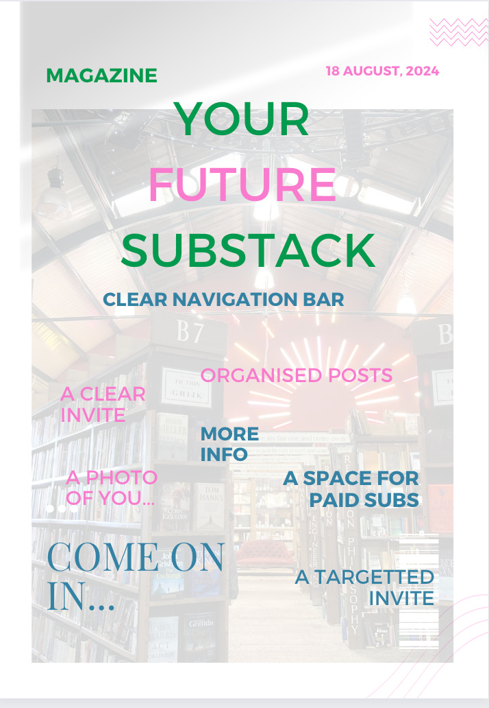
We are covering navigation, pages, sections, tags, groups and headings in today’s post… These tools are a true gift from Substack and enable us to think carefully about our subscriber/ reader flow through out publication. I want you to imagine your Substack like a magazine… can you picture it… this is the front cover…
Ok…
BEFORE WE START…take a look at 5 other home pages from a diverse range of people - how do they organise their reader?
FIRST - Open up your Substack home page… mine is sparkleon.substack.com
Then take a huge piece of paper and some pens - a3 is best! Tape together x2 a4 sheets and you’ve got a3!
Take a look at your home page - where might someone go from here… how many places are you inviting them into? Scribble down the invites you have…
Take a look at the stats - which of your home page posts is driving most subscribers? Why?
Is it clear and obvious what you want your reader to do here on your home page?
Does your imagery blend well with your brand? Are you asking people to read too many things at once?1 Have you put lots of text on images and is it looking messy. How hard are you asking someone’s eyes to work? Are your descriptions clear?
For me, I want to do 3 things as folks arrive so not the most streamlined example for you… but here it is…
invite ‘beginners’ into one place - my ‘welcome’ post or to ‘simple Substack advice’
‘new readers’ (colleagues) who don’t need Substack beginners advice to another - perhaps a popular post?
my ‘members’ and ‘diamond’ members to their own section!
Knowing Substack the way I do and responding to my reader questions, this subscriber flow makes the most sense to me.
I’ve completed over 35 Substack audits for folks and the biggest ‘mistake’ I see is TOO MANY invites from the home page, too many tabs… science has proven it sends our brain into shut down and makes the experience confusing.
We want to be as CLEAR as we can be!
There’s nothing you can ‘do wrong’ here because we EVOLVE as we go BUT it’s worth giving all of this some thought when you’re getting set up.
Let’s get into the Subscriber Flow in your navigation on your Substack home page….
To decide whether you want to group specific posts into a tag or a section or create a page here’s how to work it out…
A PAGE = a web page - you publish to Substack. It isn’t emailed out and people can’t comment on it. It has it’s own URL. GREAT for contents pages or grouping urls for complex topics. For example if you’re a therapist and you want to create a page of resources and then send that out in your welcome email.
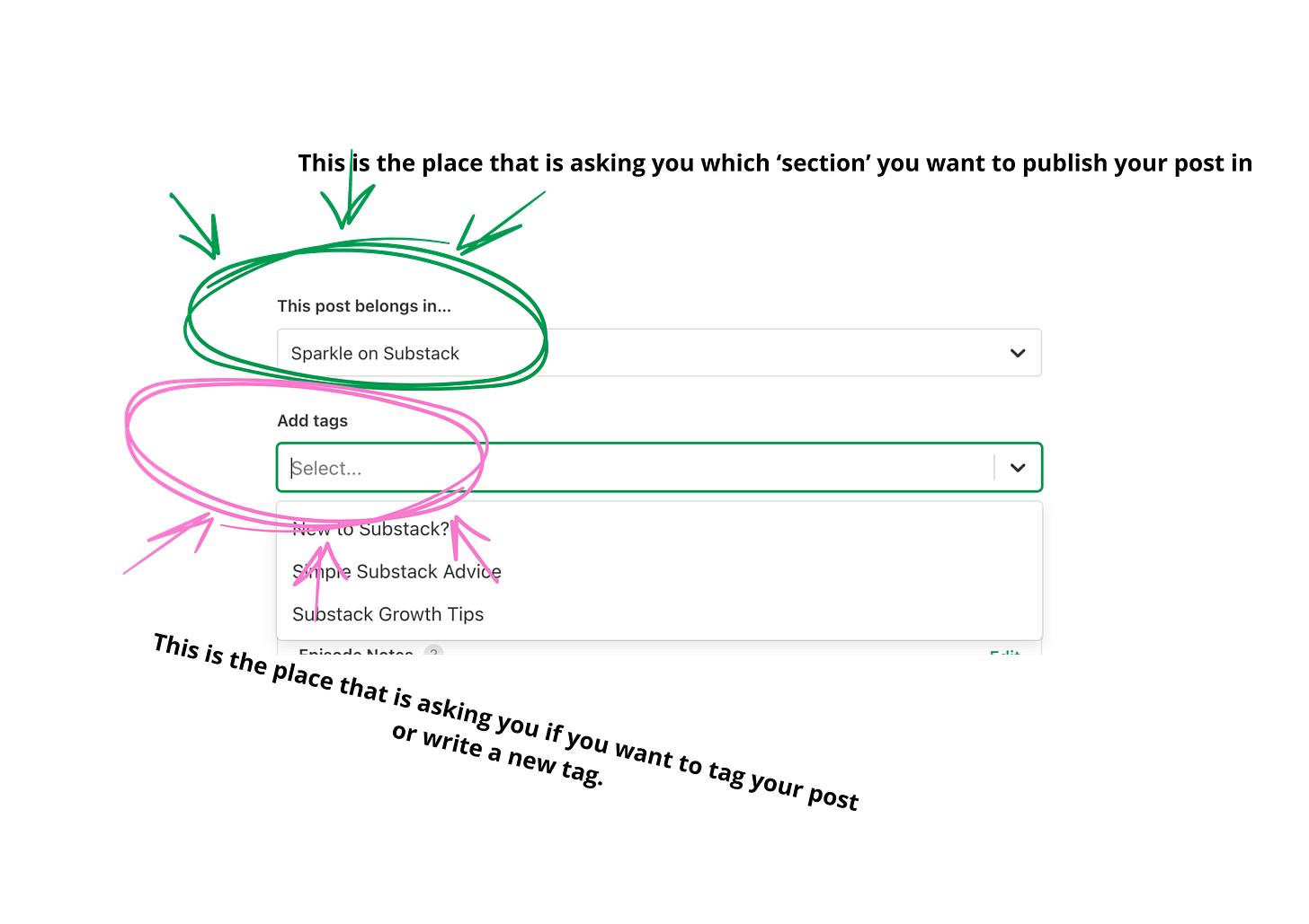
A TAG enables you to group
infinite2 posts into one URL to share so for example this post sits in a tag called ‘Simple Substack Advice’ I set my tags and choose them at the point I publish but you can find tags in settings too.
A SECTION is a mini newsletter within your newsletter publication and enables you to subscribe or not subscribe your email list.
People can choose to opt in and out of a section once they know their way around Substack. Many will NEVER do this as the setting is relatively hidden.
I personally don’t recommend adding a tonne of sections unless you are
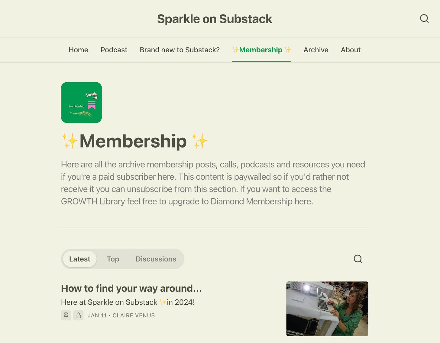
and then I do! Ask me why in the comments…With a section, you also get posts grouped into a URL in a section and the bonus is you can have some ‘explainer’ copy at the top of your section as people land… you can also ‘pin’ a post.
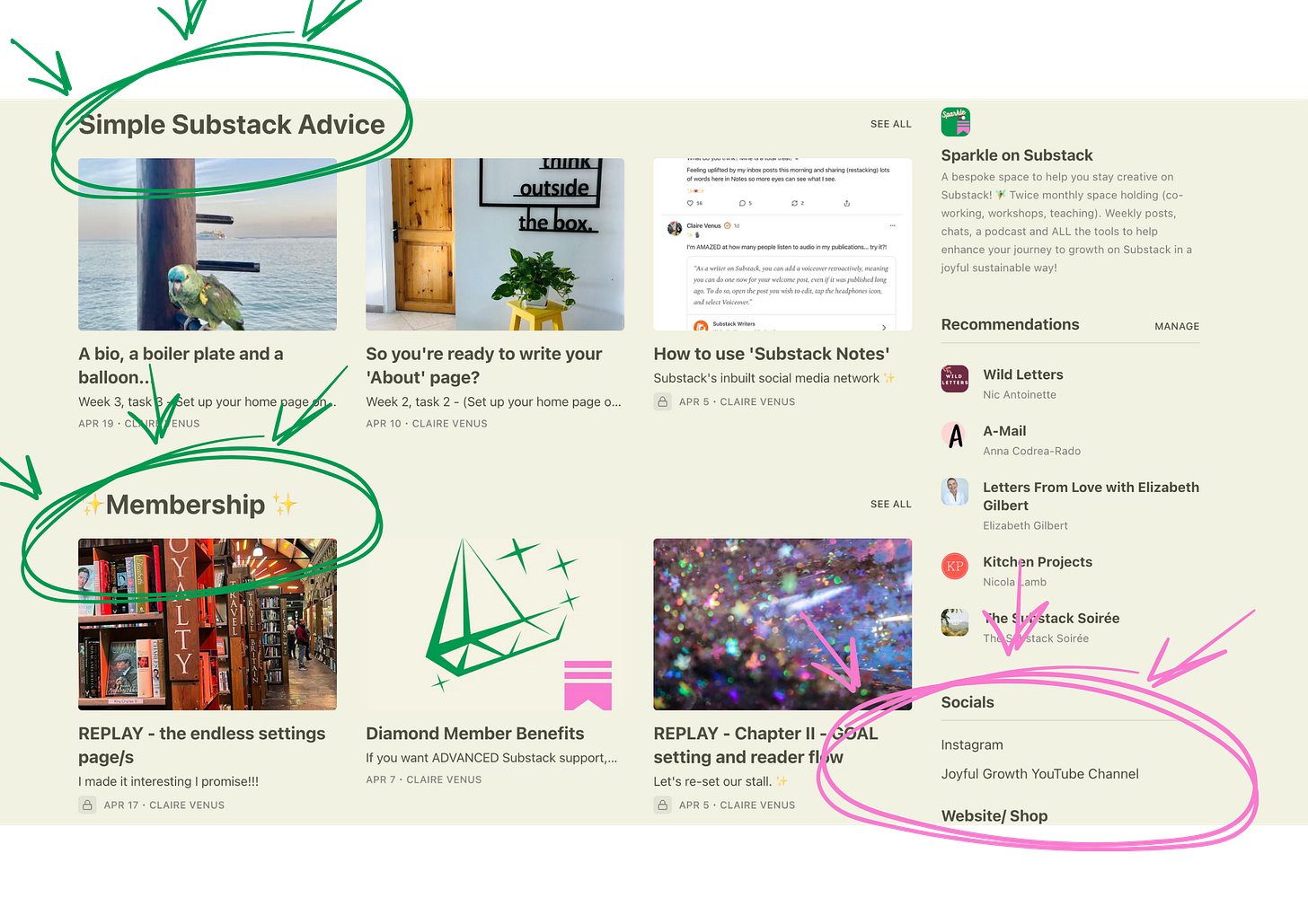
On my home page;
Simple Substack Advice is a ‘tag’
✨Membership✨ is a ‘Section’
Socials/ Website shop is accessible in ‘Homepage Links’ in settings…
You can access all of these wonderful organisational tools in your settings.
Here’s an explainer video about your settings page.
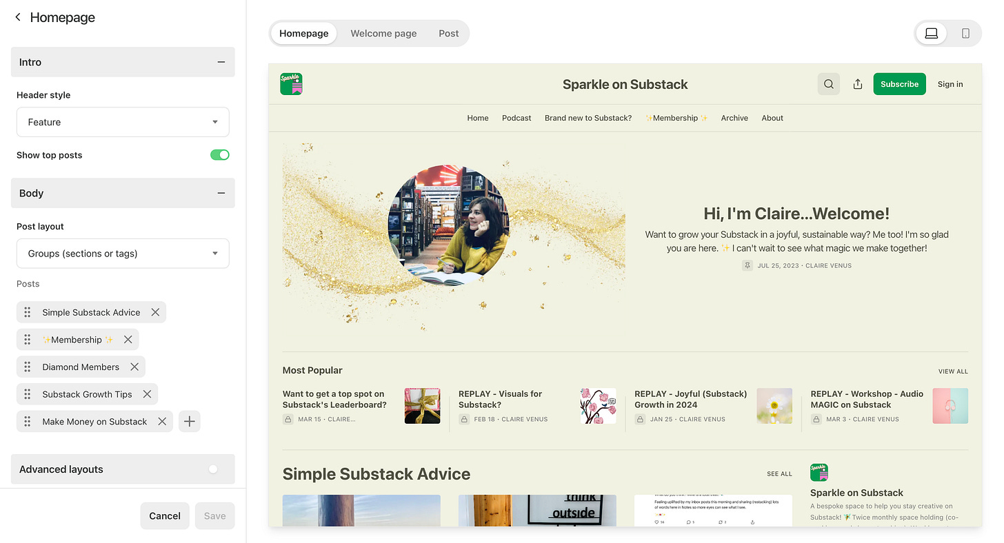
Homepage links - these are circled in pink above ⬆️
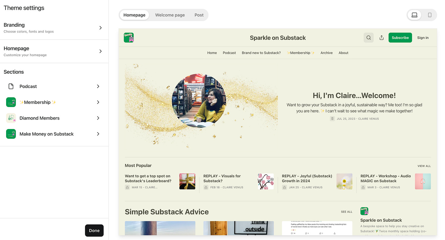
Site Design - this is where you can change your colour and font styles and also add in headings from pre-existing tags and sections like I have. ⬇️
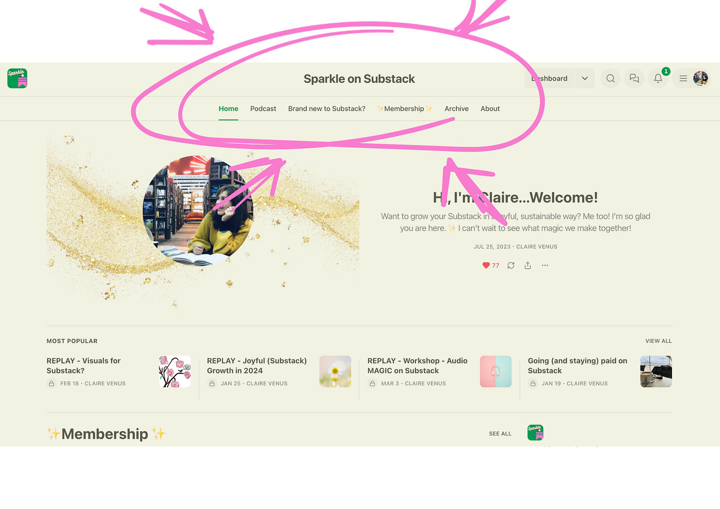
Your Navigation Bar is underneath your Publication Title/ Wordmark. Mine is ‘Sparkle on Substack’ and I haven’t replaced it with an image here but you can. To do that you replace the ‘wordmark’
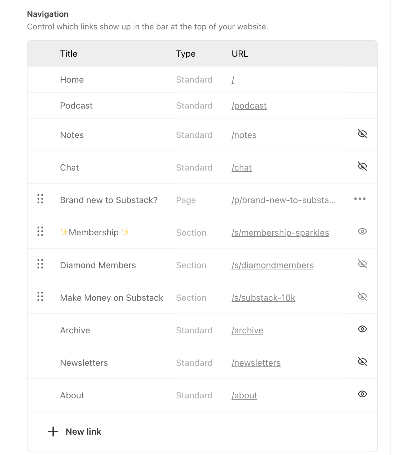
Navigation
To change the way you navigation bar looks head to your settings and you can turn pages, sections, tags on and off here… I would always advise leaving ‘archive’ on because this is a chronological list of your posts and I use this a lot as a reader. In theory you can turn your about page tab off but I think it’s super useful so I leave it on.
Home Page organisation back end…
Phewf ok, I think we’re there.
I talk more about how to tidy up our home page in these two tutorials for paid members.
PLUS the strategy of why I use pages, tags AND sections across my Substack publications. Feel free to jump in and solve your Substack mystery with us.
Lots of screen sharing and figuring things out together! Come watch the replays and know there’ll be another live call on this topic in June!
I hope this information is helpful and it’s been a delight to support you through this 30 day challenge…. 🤗
There’ll be a BONUS task next week and you are welcome to join us as a member of Sparkle on Substack anytime!
Sending sparkles for your Substack journey ahead,
Claire
✨
PS - If you would like strategic support on how to set up your Substack so it works the best way it can for you join us in the Sparkle membership or book a 1-2-1 consult with me.
Thanks for being here - it’s a joy to support your Substack journey and do this work. Let me know if you need anything and I will have a resource to help.
Remember people skim read looking for the info that is most relevant to them or most interesting… help them to do that…
I presume it’s infinite posts… I haven’t reached the end of being able to tag anything yet 🤓








So much here, thanks! I’m up for this challenge. I didn’t realise we could make pages, that’s so helpful.
Thanks so much for this Claire. I'm new to Substack and would like tabs to Latest, Top and Discussion on my homepage, similiar to how "Astrology with Alice" has them. Do you know how to configure my publication to achieve this? I have tried Magazine and Newspaper layouts, but can't work out how to get these tabs/links. Thank you for any help you can give! https://alicebell.substack.com/