What's in a LOGO?
Week 1, task 1 - (set up your home page on Substack - a 30 day challenge).
I’m Claire. I’m an Engagement Consultant and Mentor and director of a company called Creatively Conscious. I teach folks how to grow joyfully and sustainably on Substack. I’m delighted you’re here.
Hi all,
How are you? ✨
WELCOME to task 1 of the set up your home page on Substack in 30 days challenge.
Great for beginners but there are some advanced tips too! Let’s get into it…
Your “logo” on Substack sits on the top left of your home page.
You can see my logo for
here… I’m not a designer or branding expert but I have done lots of training with design experts using canva and worked with lots of artists and designers over my career.Branding is a HUGE area of expertise and I am going to keep things very simple here for you to help you to make your decision…
A logo, let’s pick a logo
I made my logo in canva and it’s SUPER bold as it’s VERY tiny depending on the size of your screen. It took me less than 20 minutes because I came to the keys knowing EXACTLY what I wanted.
This is your first question - what do you want in that space and why? Despite it being called ‘logo’ in your dashboard settings, you don’t actually have to make and use a logo. You get to put what you want in there…
There are a gazillion logos and ideas for logos but what do you want?
A photo
A traditional logo
A logo with text (tread with caution)….
My laptop is 13.6 inches meaning most of the logos people make are illegible to me BUT I love my small laptop so I’m giving you advice from the way I see it.
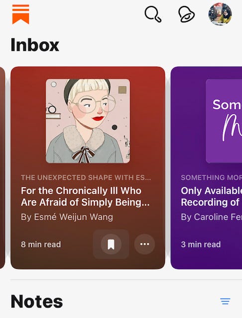
We also need to take into account how our ‘logo’ shows up in Substack Notes because those seem bolder and more enticing to click on…
Here are some examples screen shotted from my iPhone…
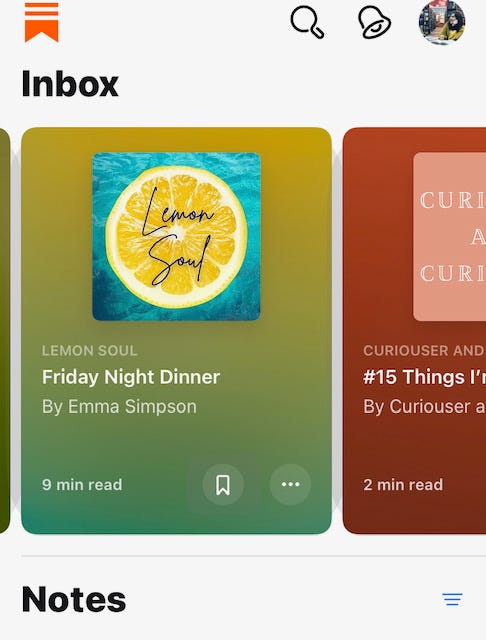
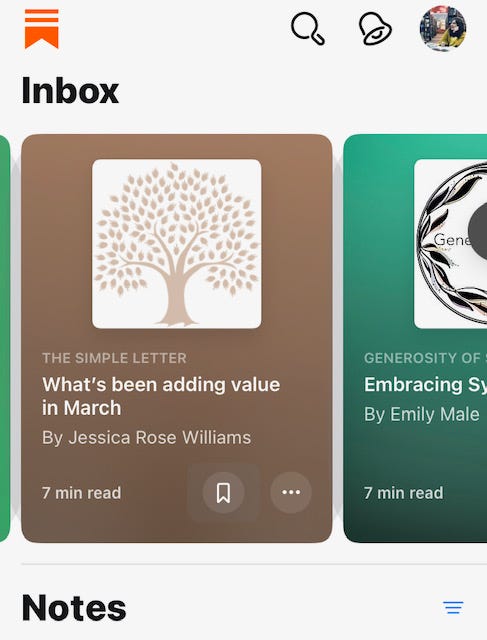
Which publication did you instinctively want to click through to read? We’re all friends here but you might have a preference as to what you think ‘works’ best or would work best for you….?
✨
Tips to design up your Substack Logo space…
Just pick something you own and like (for now)
You can change it later!
SIMPLE - You can choose a photo that reflects the essence of your Substack. If you’re not sure of the essence of your Substack I have a guest expert class on that here with
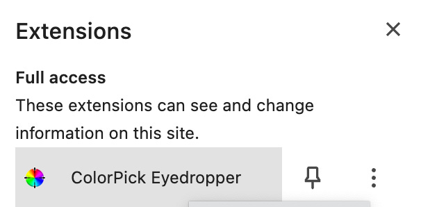
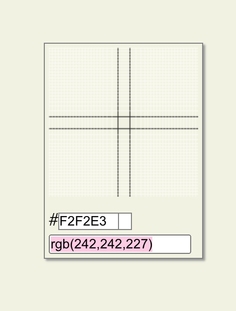
for my 💎 Diamond Members.ADVANCED - If you have an ‘accent’ 1colour chosen why not choose something, anything to reflect that. My accent colour is green and it’s the same hex code as my logo. To find out what hex codes colours you like/ have you can download the ‘colorpick eyedropper’ for google chrome.
If you use a ready made logo template in canva make sure you change at least two elements of it AND the colour otherwise your logo won’t be unique. Your logo absolutely needs to be unique to you. Add duplicate designs in the page in canva and tinker with a few bits and bobs, change colours, add elements, - see if you can create something you LOVE. If you find it too frustrating, too difficult to make a decision circle back or…
Consider working with a pro if you have the budget; not only is the process super fun, you learn lots about your business/ brand in the process.
My guest session with Lauren is a great place to start and you can also meet illustrators over here in my get together class I co-hosted with
…
Top tips - Keep it simple, don’t choose too many colours…3 max - when you’re ready to download your logo think about if you want it to have a transparent background or a shape and block colour…
Ok we have 7 days to get something we LOVE in that Substack logo space! You can change it of course but I’d love you to get something you are happy to stick with and grow into, something that you feel represents you and your publication. Choose something you’re proud of and you’d like to see every day.
I’ll be back here next week with your next challenge as part of the Set up your Homepage in 30 Days Challenge - let’s go!
Questions? There are NO silly questions; let me know what you need in the comments. What’s the first step you’re going to take to make/ refresh your logo?
Let’s SPARKLE on Substack!
Claire
✨
PS - Our paid members class is next Monday 8 April and we’re reflecting and goal setting for the next three months - can’t wait!!
More here…
Thanks to
, , for inspiring my diverse screen shots of staying creative with our logo options here on Substack!!An accent colour is the colour you pick for your buttons/ highlights here on Substack.



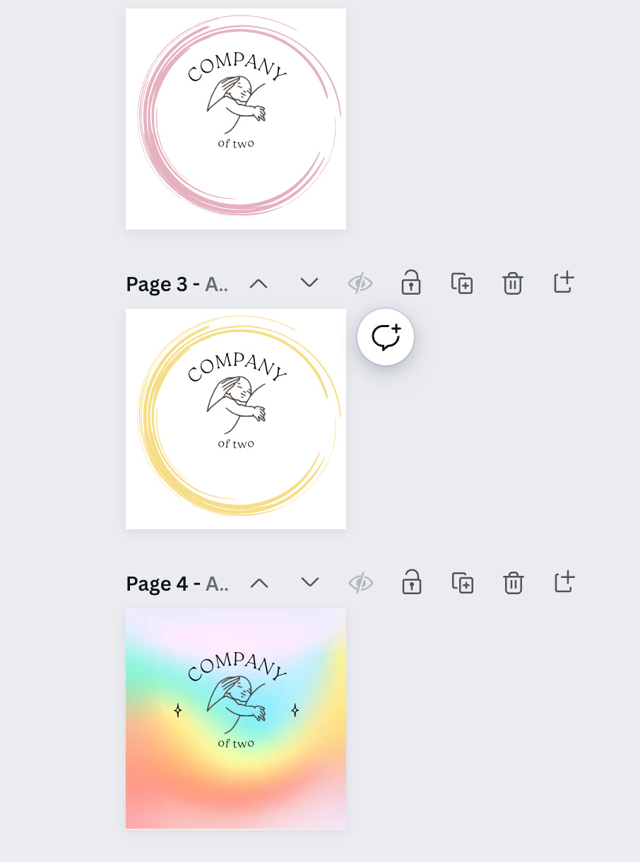

I was lucky with my logo. I had a 10-year-old help me in getting it done. He's 11 now, and saw the logo on Substack last week. He said, "I really enjoyed working on that logo with you, Dada".
Melted my heart!
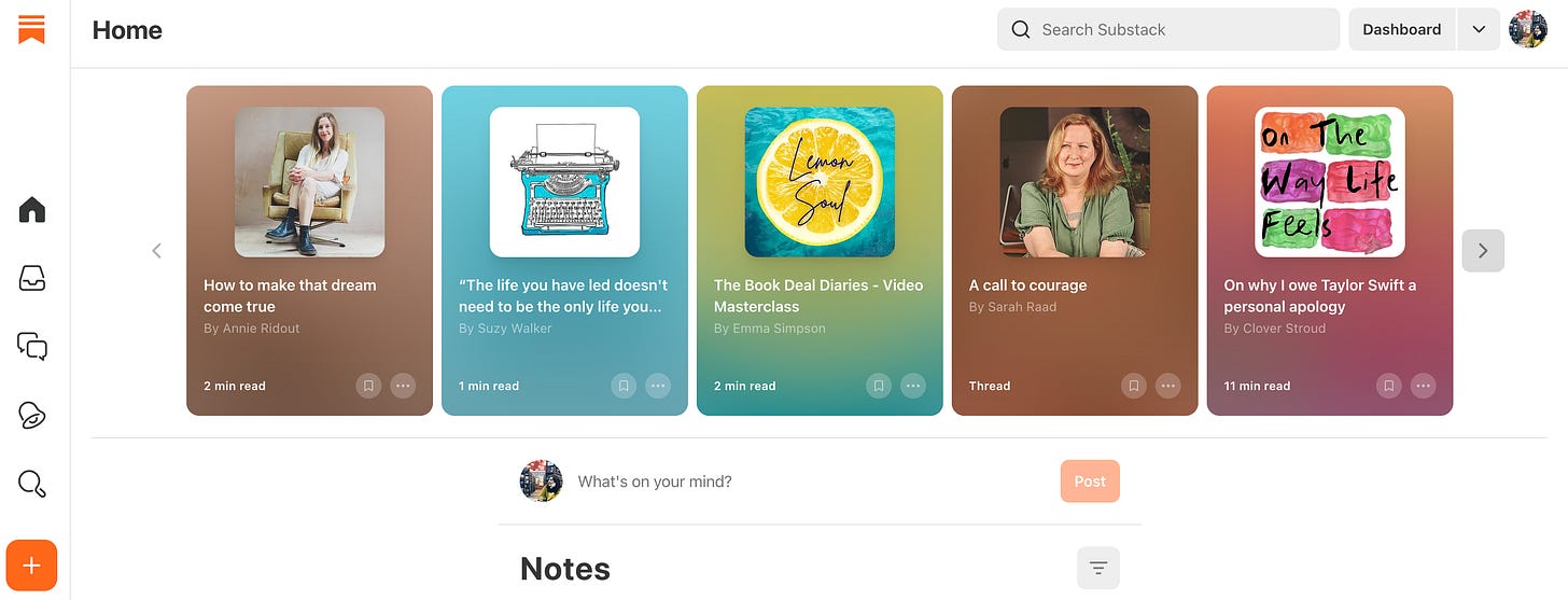
Aaw thanks so much! I love my logo but I’ve never really revisited it in my head so thank you for noticing it! 🙏💕🍋